


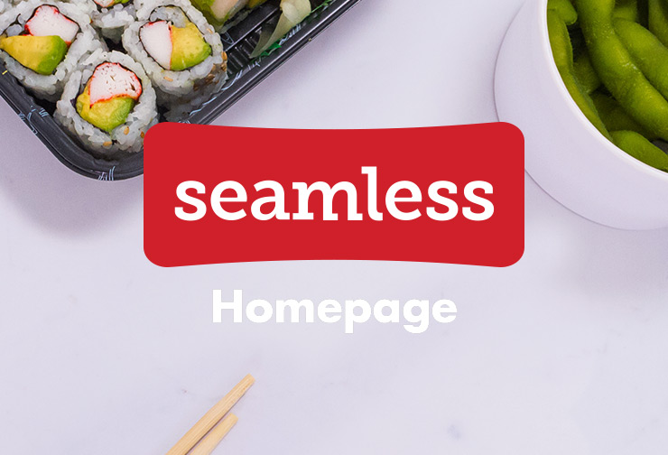

Homepage

Seamless Homepage Redesign
After a rocky product re-platforming in the summer of 2015, myself and 3 other marketing designers worked with the product team to decrease our customer bounce-rates by revising the re-design of the entire seamless ordering process from landing page to order confirmation in 1 and a half months.*
Our goal was to give Diners a new ordering experience that was in-line with the Seamless brand, and didn't make them question everything they thought they knew while they were hangry state of mind.
This project details work that I did for the homepage.
Design Progression

"Classic" Design

Initial Relaunch

Revised Design


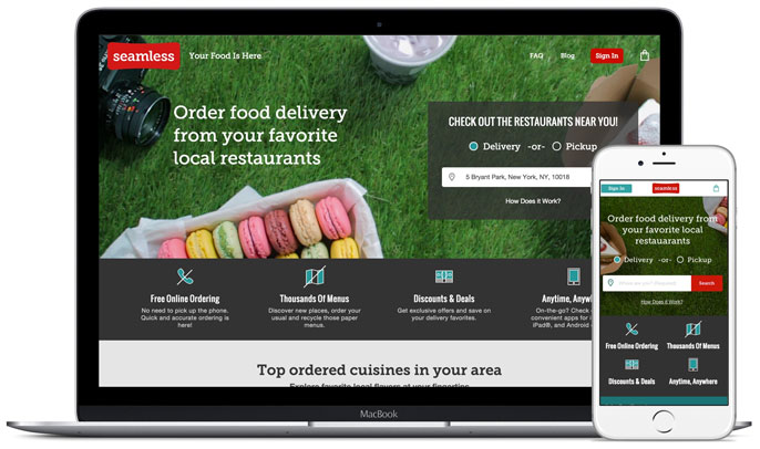
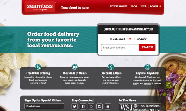
The "Classic" Design
Replatforming teams initially assumed that the original homepage had too many options and distractions which were preventing Diners from jumping into the transaction funnel as easily as possible. They sought to remove anything extraneous from beginning the ordering process and ensured the address bar was the dominant content on the page. Geo-location and order history based recommendation tiles were intended to live below the Hero section, but none of this was ready at the time of the site launch.
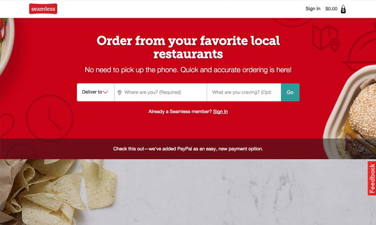
The Initial Launch
The new page stripped all content to the point that it appeared broken, the brand's historical SEO value plummeted, Returing Diners either felt they were at the wrong site or were too frustrated and lost to complete an order, and New Diners were often unfamiliar with the concept of online food ordering and required further explanation.

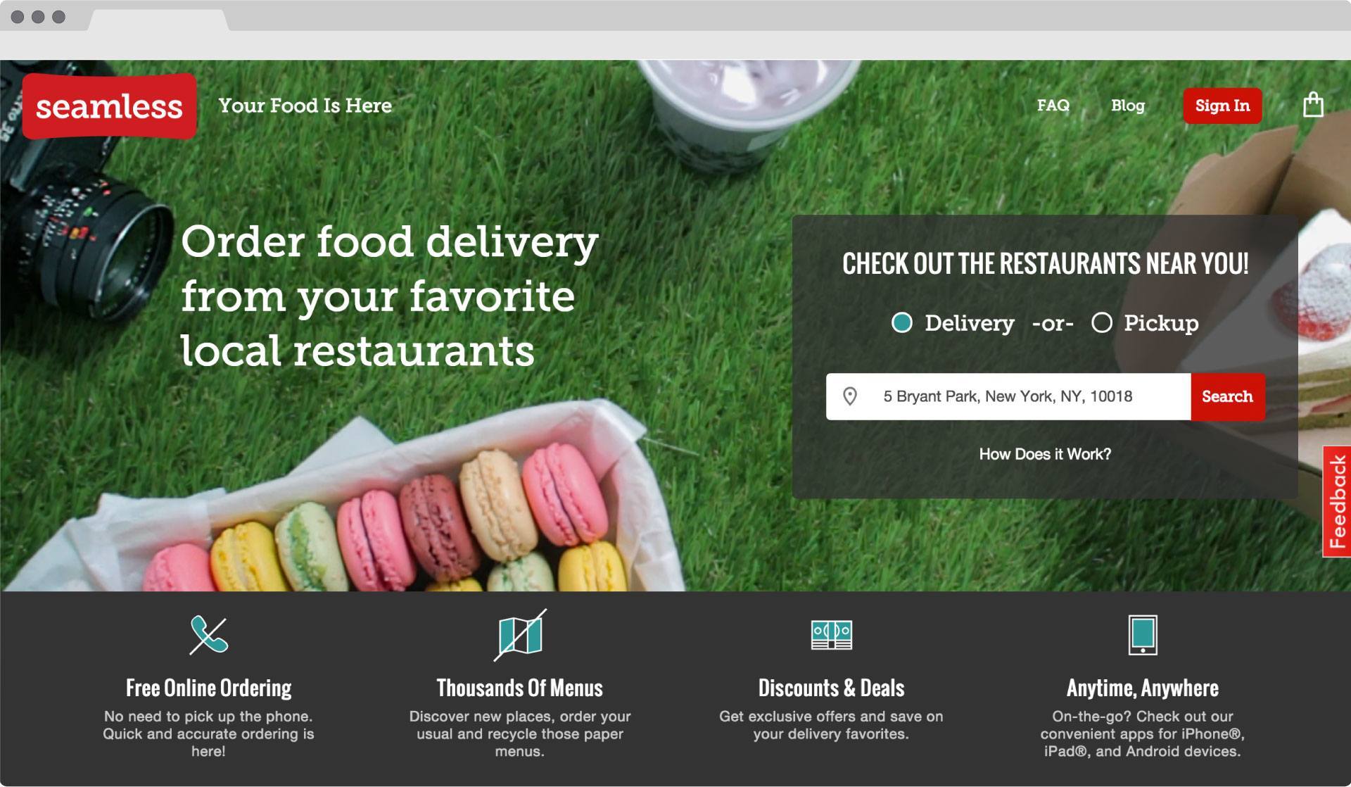

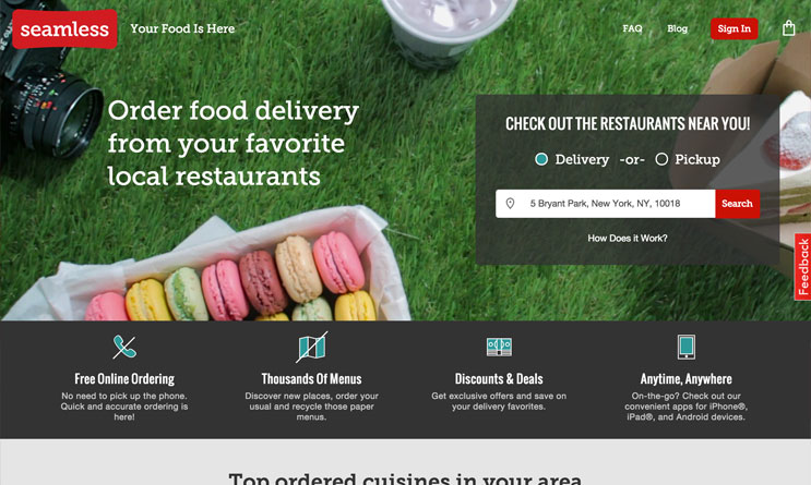
The New Page
To mitigate the site launch issues, I worked with marketing and product designers to quickly create a hybrid version of the homepage that felt more familiar and understandable, while also contemporizing the look and feel of the brand. We sought to:
- Retain the brand's top-down photography style, but bring it to life with video
- Retain the "classic" ordering widget, but give it more focus by creating a focused Hero
- Give everything more space by increasing the max content width from 940 t0 1440px
- Streamline the brand value proposition
- Re-introduce the normal use of greens and greys and use the brand red as sparingly as possible
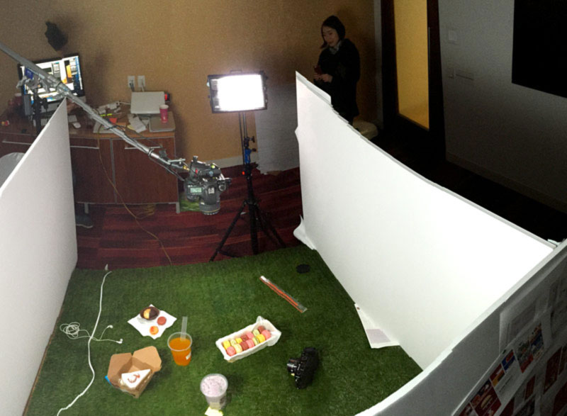
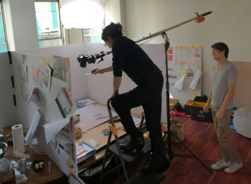
Video Heroes
To create the homepage videos we made a video overlay of the homepage interface at various breakpoints in order to stage the sets, and at the end of the week we had 5 videos for Sushi, Thai, Mediterranean, Breakfast, and Dessert. We ended up publishing Dessert first as it was summer at the time and then tested them against each other with sushi being the winning video.

Completed Videos
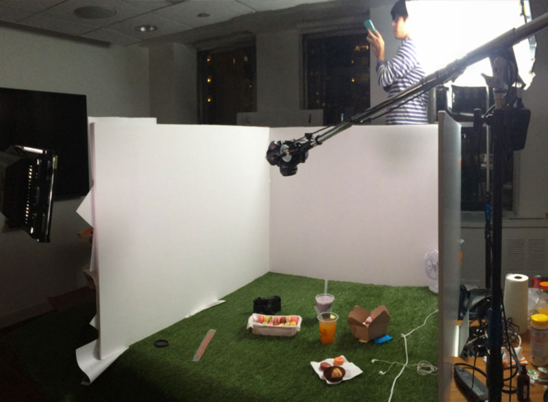
Studio Images


*As our back-end system and products were re-built over the previous year, the front-end presentation of the website often took a back seat in order to maximize the rate at which testing, quantitative insights, and optimizations were made. Product teams were also separated into isolated verticals in order to maximize ownership and speed, but an unintended consequence of this was essentially zero room for dialogue and collaboration. When launch time came around the company released a product that was the culmination of disconnected product experiments and teams. Any semblance to the exsiting brand, and ordering workflow that our diners we're familiar with was changed and orders began to plummet. This was a learning experience for all members of the company in the value of qualitative insights and understanding how different tools and products integrate with each other to create a comprehensive experience.