

Order Confirmation Page

Seamless Order Confirmation Page
After a rocky product re-platforming in the summer of 2015, myself and 3 other marketing designers worked with the product team to decrease our customer bounce rates by revising the re-design of the entire seamless ordering process from landing page to order confirmation in 1 and a half months.*
Our goal was to give Diners a new ordering experience that was in-line with the Seamless brand, and didn't make them question everything they thought they knew while they were hangry state of mind.
This project details work that I did for the order confirmation page.
Before

After

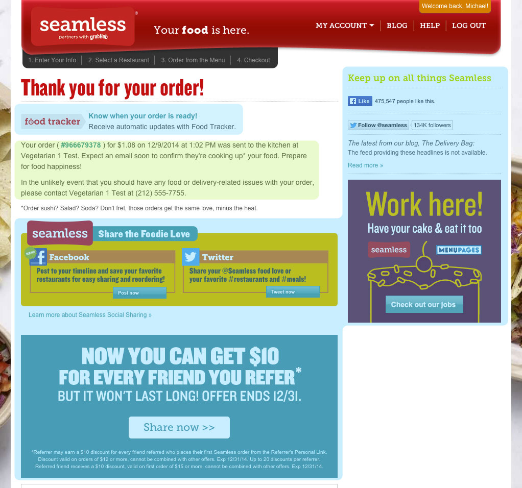

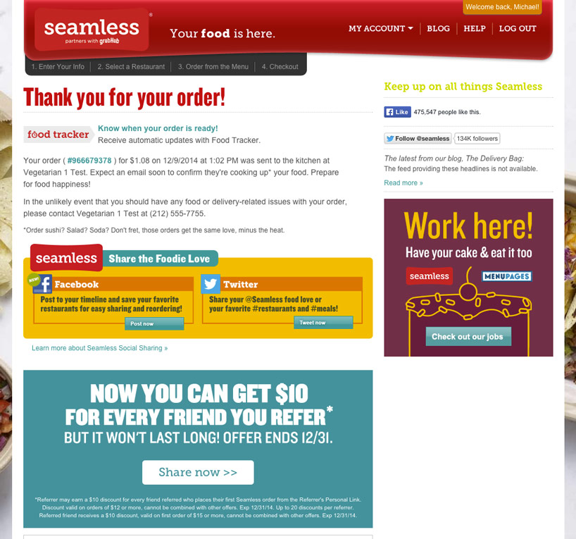
The Original Page
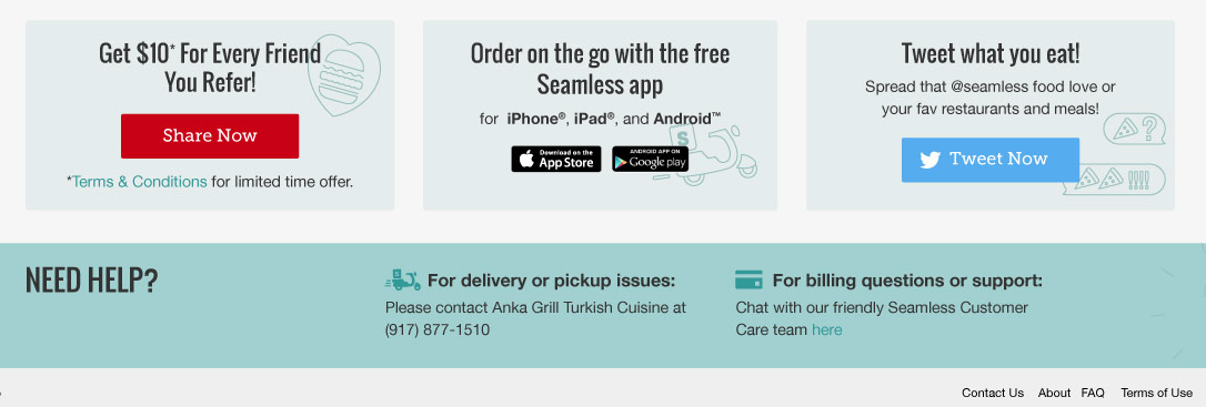
The majority of content on this page was marketing banners and initiatives. Content strategy was guided by the notion that everything post-transaction should be focused on re-engaging Diners with the brand, but this was handled in a way that caused the primary page content to be dwarfed by secondary messaging. This design makes it hard for Diners to find info like order details and customer care and easy for them to assume that only marketing info is on this page.

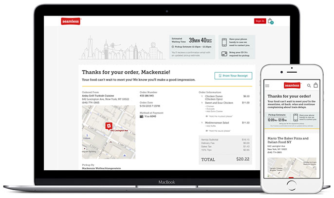
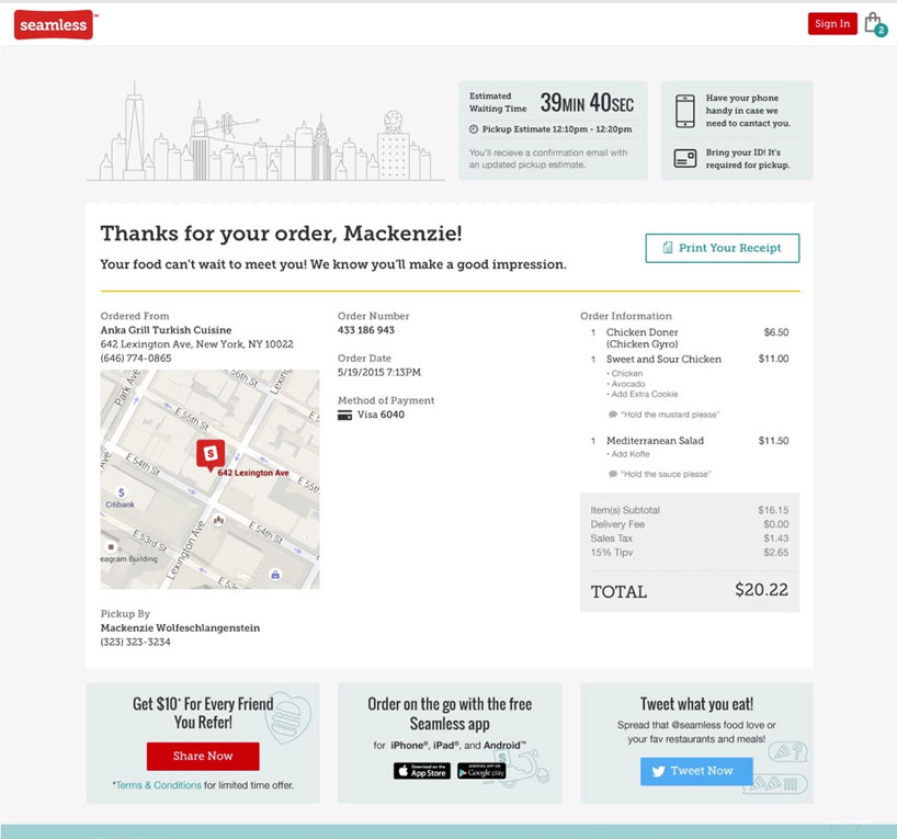
The New Page
In addition to more cohesively integrating marketing spots into the page I reached out to our care team to understand what other order info could be beneficial to Diners and they informed me that:
- Diners most often inquire about what time orders will be ready
- Diners don't always remember the full details of larger orders
- Many ask about how to get copies of their receipts for invoicing
- Diner's are often unsure of when it is best to contact the restaurant vs. Seamless
- Diner's never know their order confirmation numbers, but these aren't actually needed
With these points in mind I sought to increase the utility value of the page for Diners by emphasizing things that they were asking for through our care team such as Delivery and Pickup estimates, full receipt details with an action for printing, and greater clarity of contact methods.
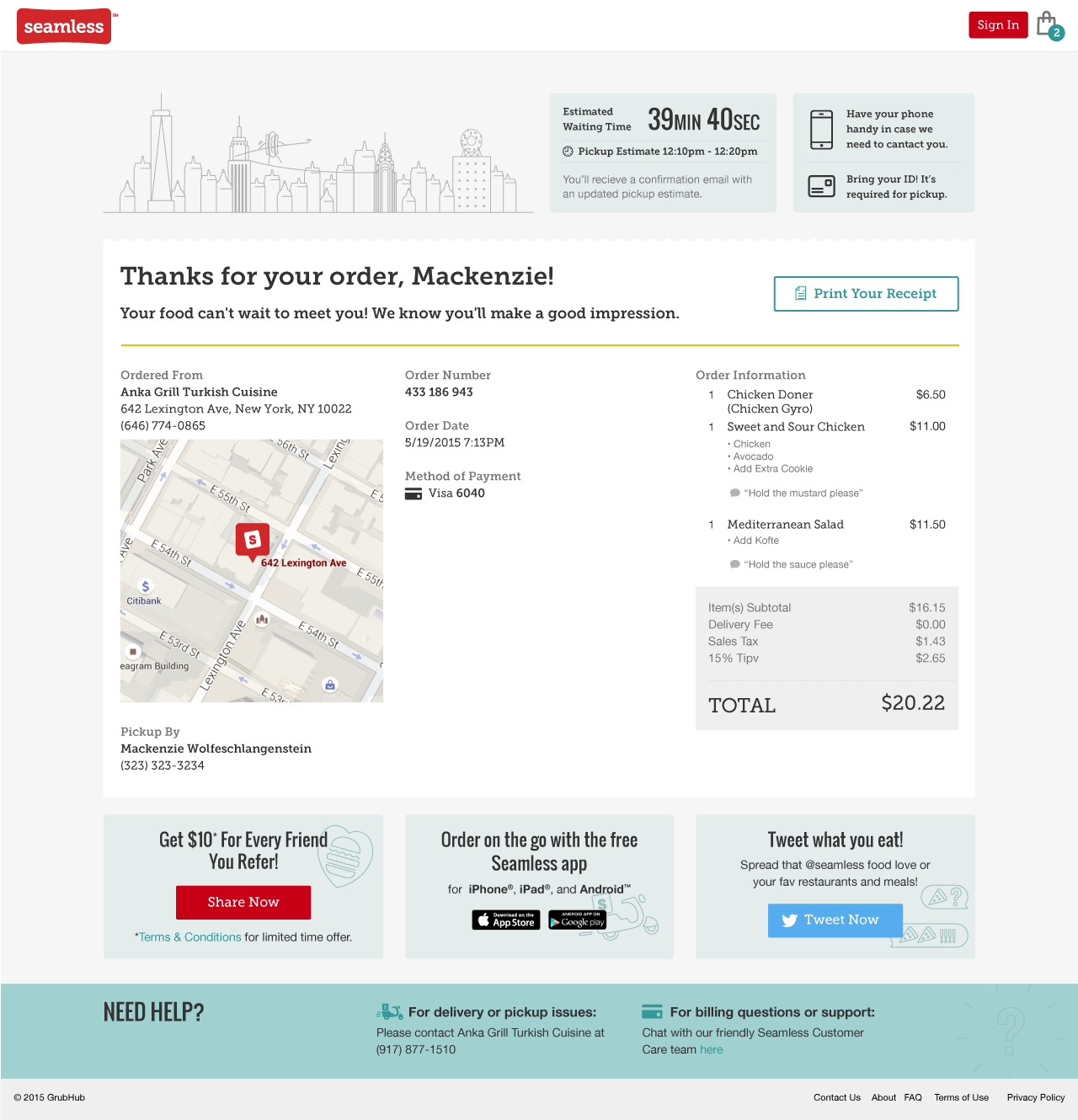

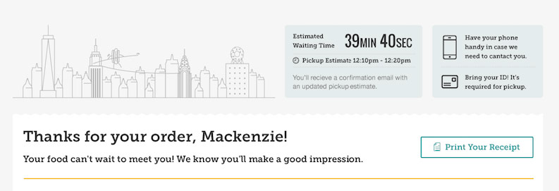

At The Top
Diners see a thankyou message, wait-time estimate, & print receipt utility. The ETA box informs them if an order is for Pickup or Delivery. I also made an illustration that in a complimentary style to add more brand expression without being distracting.
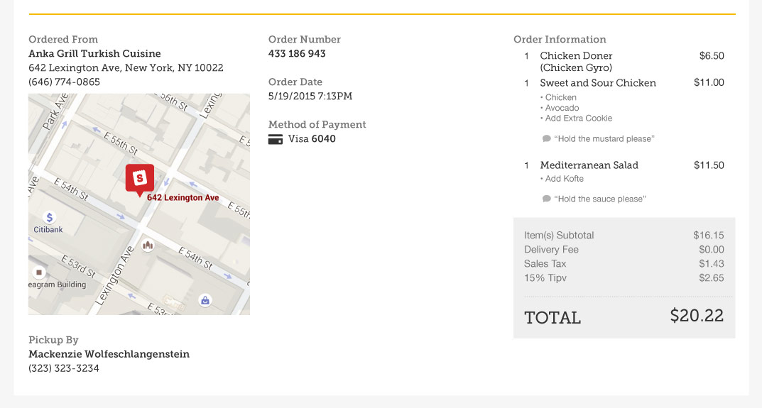
Receipt Details
Diners are presented with full receipt details and special instructions in the same style as the ordering cart. They are also presented with location and contact info for the restaurant, and info that is useful for invoices like order date and payment method. The order confirmation number is also accessible but has been de-emphasized since it is rarely referenced.


Closing Out the Order
Now that order details have been given proper prominence, marketing and support messages can round out the messages and actions on the page.
Sketches

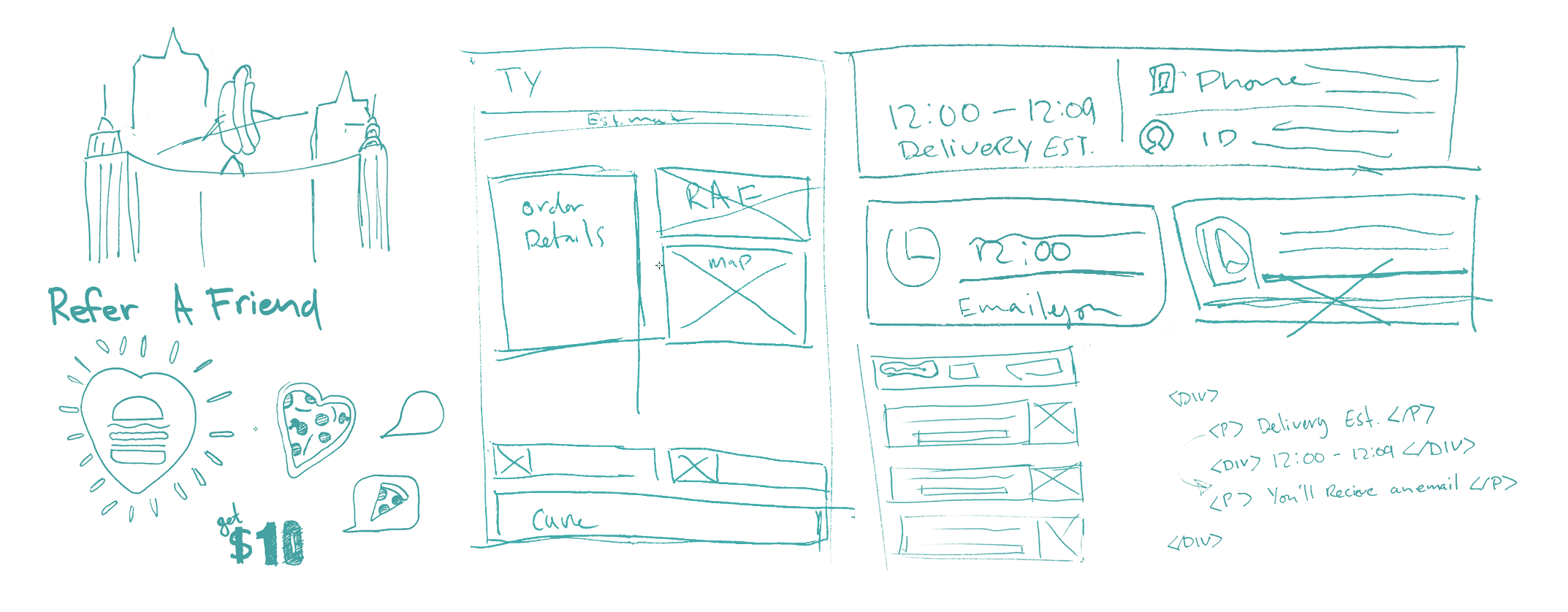
Illustration Style
I took an existing secondary illustration style from the brand library and began combining elements to create a cityscape that was inspired by the documentary Man on Wire. The goal was to create something light-hearted, but still very focused on NYC. Normal application of this illustration style can be seen in the marketing sections at the bottom of the page.
Layout Sketching
Most of my sketching was focused on how to separate info into distinct content modules that could be stacked in a sensible way for mobile but also flexible enough to handle a multitude of order scenarios from, from Delivery and Pickup, to potentially Group Orders in the future.
*As our back-end system and products were re-built over the previous year, the front-end presentation of the website often took a back seat in order to maximize the rate at which testing, quantitative insights, and optimizations were made. Product teams were also separated into isolated verticals in order to maximize ownership and speed, but an unintended consequence of this was essentially zero room for dialogue and collaboration. When launch time came around the company released a product that was the culmination of disconnected product experiments and teams. Any semblance to the exsiting brand, and ordering workflow that our diners we're familiar with was changed and orders began to plummet. This was a learning experience for all members of the company in the value of qualitative insights and understanding how different tools and products integrate with each other to create a comprehensive experience.